Aryonix logo, design and relation to future product
Aryonix, close in sound to Baryonyx (a genus of theropod dinosaur which lived in the Early Cretaceous period), refers to a presence that we have only maybe experienced in our dreams, or nightmares. Something ancient, from another, more perilous, time. A time where evolution produced the most ferocious beasts that have ever walked Earth.
Provoking a mix of excitement and fear, would we ever see one of these animals right in front of us.
Making what does not exist anymore, real again, through technology.
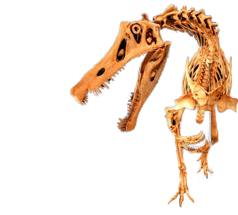
The core mission of Aryonix is to enhance photorealism of synthetic scenes that don't exist in reality but are built by artists. One example of this, is to bring back dinosaurs to real life, by enhancing the photorealism of current depictions without needing real photos of dinosaurs. This is one of the reasons I built a logo that showcases the face of a dinosaur, because it represents my values for the project and reminds me what the end goal is: bring the synthetic/limited world towards the real world, and consequently, bring cgi dinosaurs to life.
This defines the soul of the Aryonix project, that one day my childhood dreams of experiencing real looking dinosaurs may come to life.
The day Aryonix makes it easy to produce photorealistic believable dinosaurs in real time, on screen, then I have won.
Conception of the Aryonix logo
The first step was scribbling the general idea I wanted to get through. The logo should have very few strokes. Basically, I should be able to quickly draw it with a pencil with fractions of geometric shapes like circles, squares, triangles. This was quite convenient since I am bad at drawing.
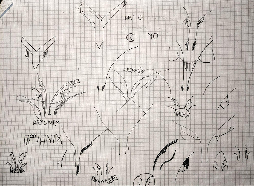
I used symmetric quarter circles to draw the outlines of the facial structure of a dinosaur with eyes. The “ARYONIX” text was placed under to represent the teeth. I added some curves to the exterior stroke, to outline the facial shape better as it was looking too much like a small animal (i.e. a fox). It is crazy how, when using the lowest possible amount of strokes to draw something, every little detail counts. Modify the curve of a stroke a tiny bit and suddenly it doesn’t look like a dinosaur anymore but a dog or a cat. Minimalism amplifies the influence of every detail.
I took the idea to Illustrator, drew the right side and used symmetry and got this.
The “ARYONIX” text was slightly simplified by removing the horizontal line in the ‘A’ and ‘R’. Additionally, to evoke teeth and claws, I sharpened the leftmost and rightmost bases of the text. I preferred curved strokes over triangular shapes or perfectly round shapes, I find it gives a more sleek and modern look.
This logo worked well on larger screens but looked like it was missing something when the text was removed and it did not display well in smaller formats. The alternative versions below did not solve these issues.
To alleviate the fact that it did not look good in a smaller format, I inverted the shapes to get something like this.
This worked much better for smaller screens but looked too bulky for larger formats. Additionally, it felt like something was missing below the shape. The abrupt stop had no reason to be there, especially when the teeth (“ARYONIX”) are not present. Finally, I created a version that was a compromise of both worlds, filled vs strokes.
In this case, the right side is filled and the left side is made of strokes. The filled part is curved to evoke how light would hit one side of the face of the dinosaur. This approach makes it more natural on the eyes, because what is in the darker areas could be hidden in the shadows. Our brain is left to guess the shape and interpret it in its own way. Additionally, this version displays better at medium format.
In summary, I delivered three different versions that can all be used at their respective scale.
Why is it important to have a logo at such an early stage?
Because it is fun. Exploring logo design and trying your own hand at it are, in fact, really hard tasks. Much harder than my typical photoshop works, which are usually based on real images. This gave me a lot of respect for the designers that create logos. I now understand why they can be paid huge amounts for such simple shapes.
Additionally, I believe that being proud of what you are building is a huge part of bringing motivation to a project. A logo can represent the values we work for and showcase them outwardly as one saying “We are creating something sophisticated, modern, at the cutting-edge of technology and we are not afraid of taking risks”. So I hope this logo hypes you up as much as me for the future of Aryonix! As always, if you want to find out more about the project, look around the web site or simply contact me.