Downhill Wings logo design
Downhill Wings is a community effort that helps riders explore beautiful routes that hopefully match their skill level.
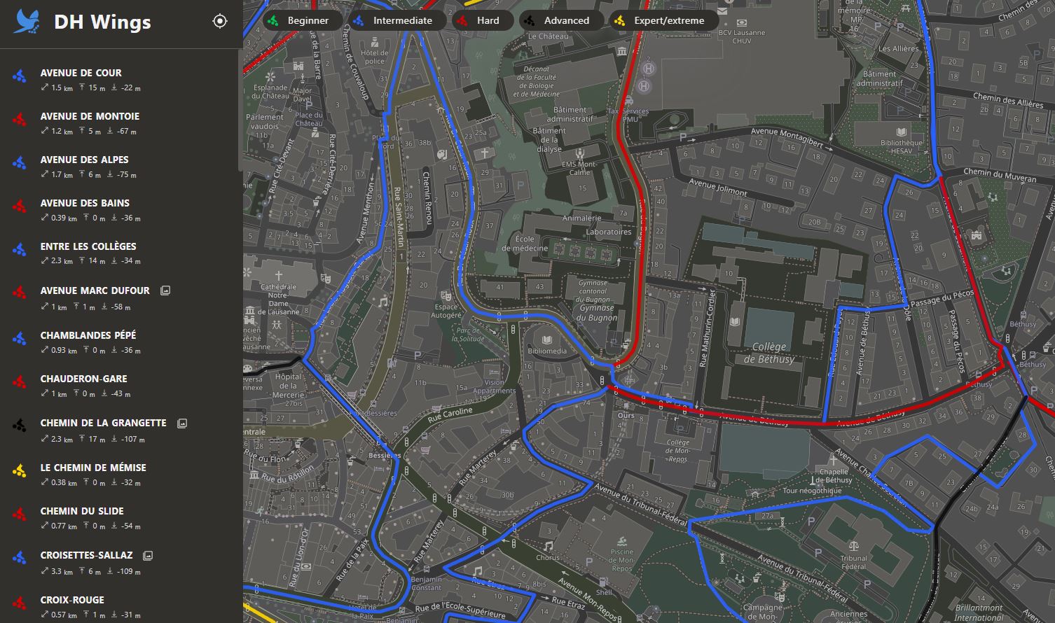
The goal of the website is to document all downhill tracks with images, descriptions, and technical data like length and slope. The main philosophy is for people to earn their wings in the downhill sports and taste the freedom and thrills it provides.
A logo for this website had to represent the educative aspect and also display a sense of freedom, discovery and adventure.
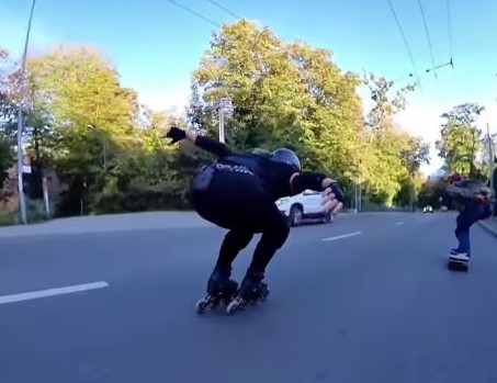
The first image that came to mind was based on an Instagram video, where an inline downhill skater was hill bombing and preparing for an aerodynamic tuck. Before doing the tuck she placed her arms similarly to how a bird would place them during a controlled dive.
This diving Falcon image was an interesting starting theme. However, I did not wish to give away an image that was too high performance or predatorial, but more open, attainable and liberating. Hence, the bird theme was kept but the action, shape and color of the bird were tuned to better represent the values of DHWings.
At the start, to visualize the educative aspect of the brand I chose to show the bird in a landing position, which evokes skill, technique and aim. I chose a smaller neutral bird to emphasize openness to all skill levels, not just high performance. Finally, I chose the blue color that represents, to me, freedom and safety. Skates were added to the feet of the bird.
When I use the words "I chose", in practice, this meant searching on google image for "landing bird" images until I found a few good images, then tracing my favorite patterns and shapes.
The first prototype from the tracing looked like this:
This first prototype had all the main ideas but it was, of course, too detailed for a logo. The next step was to minimize this shape and retain all the elements that define the theme.
A first iteration led to the following result:
As you can see, filling in the shape, drawing the contours and only critical features helps a lot. This simplification already looked better, however, it did not look polished and still had too many details when viewed in smaller formats.
For more extreme simplification, I use a technique where I try to fit simple shapes like circles, triangles and squares to my current drawing to see how to represent it with the minimal amount of basic shapes and better visualize proportions.
With this technique we get the following result, which was the chosen design at the end.
The basic shapes were used as guides, sometimes, a section will feel wrong and has to be tuned using one's own intuition and taste, like for the belly of the bird.
I noticed that placing the wheels in a slightly asymmetric fashion, inspired by the first iterations, gave a more unique look.

The final logo design is now being used on the Downhill Wings website.